
I’ve long been a fan of ease, which is a large reason why Lean management has always appealed to me—and why I’m such a fan of visual management.
Well-designed visuals provide clarity and ease—ease in understanding, and ease in knowing when to take action and when not to take action. Fast Company Design recently carried a compelling piece that describes a contest that the Massachusetts Bay Transit Authority (MBTA) held this spring to redesign subway maps. Their mission: to make the maps easier for people to read and increase their information absorption rate.
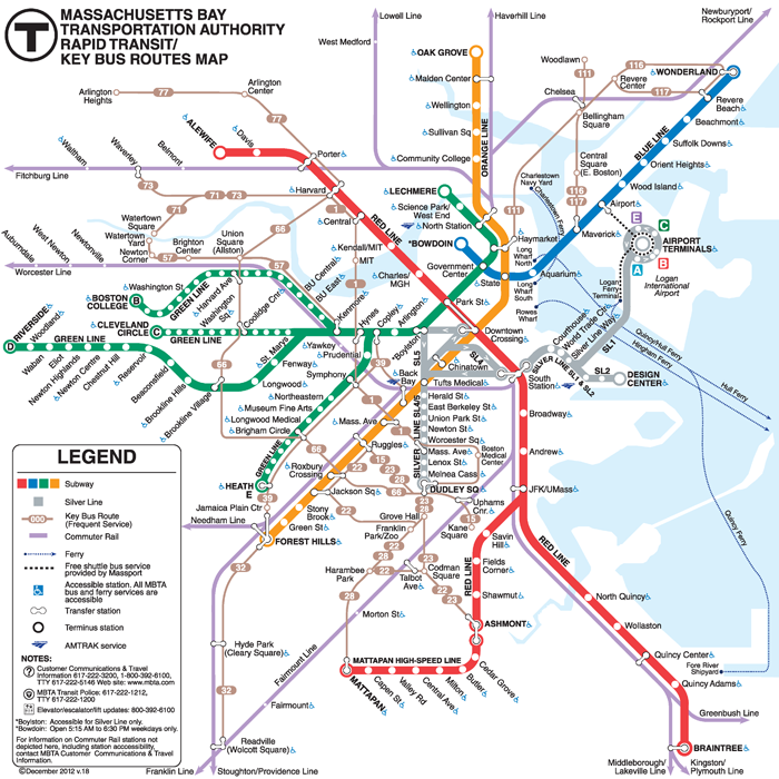
The current map at the time of the contest is below:

Image: via Fast Company – Courtesy MBTA/Massachusetts Department of Transportation
This is the winning design by Moscow-based Michael Kvrivishvili (which was tested by a team of MIT researchers who used a computer model that produced a series of “mongrels” to validate the improved design):
As the article points out, of particular note are the sharper turns the green line take and the visual ease they introduced by making them parallel. Also notice how the station names are now all horizontal vs. the slanted version in the current map. Michael’s winning design will begin appearing in subway designs in 2014.
This sentence is what struck me the most: “A map need not stay geographically faithful to be visually useful“—meaning that it’s okay to sacrifice a little accuracy if it results in higher quality output. This provides an interesting input consideration when designing visuals in a Lean environment.
When you get to root of it all, visuals communicate when to take action (or make decisions) and when not to take action. They create clarity around 4 types of information:
This is perhaps a topic for a different day, but I’ll take this opportunity to air a pet peeve of mine and make a plea to ladies restroom designers: put an end to doors that go all the way to the floor with no visual means to tell whether the stall is occupied or not. Give me green or red, occupied or unoccupied, etc.
It’s ridiculous for women to have to use trial and error and check to see if a door is unlocked or not—especially if, after trying 8 doors, it turns out that they’re all locked. And embarrassing if someone forgot to lock it. And disconcerting if someone did, but there’s a total stranger trying the door knob. Can you tell I could go on??? Visuals rock. Let’s do a better job of using them!)
Visual are an under-used way to create greater clarity and ease at work and in life. The next time you’re making improvement, make sure you include well-designed visuals in the mix. Think about the freeway map example and design away! You don’t have to use complicated “mongrels” to test your design. Voice of the customer is necessary and often sufficient.
Great application, Brent. Happy furniture arranging!
by Brent Brewington
Another great post, Karen! This comes at a good time for me. I was getting ready to make a couple maps of the Atlanta area to post on the wall of my new apartment: one for restaurants, shops, etc and one for parks and hiking/biking routes. I was going to get a fancy exact map printed up which would be pretty expensive, but I realized I could just marker out a simpler one that shows general areas of the city.
Another application: I’m organizing furniture in my apt, and I was going to measure exact dimensions to make a floorplan to work with. Duh! Why not just work with a rough sketch? As Juran’s Quality Manual definition says, “quality is defined as something being fit for its purpose”…like you said, definitely applies to visuals.